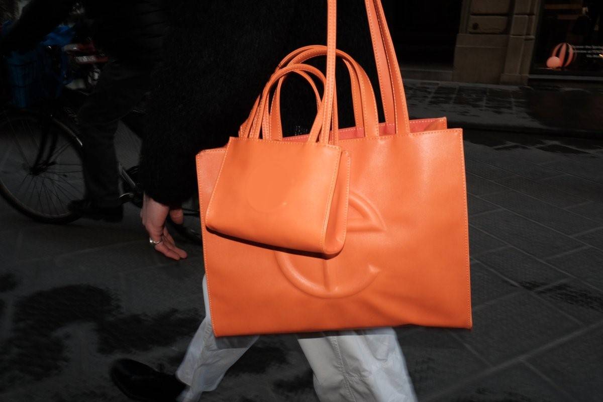
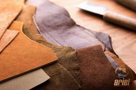
if you are among people who love pretty, fresh, and sharp colors, and are searching for your leather tote bag, we recommend you choose orange! But if you are a fan of those natural colors it’s better to choose between black or brown.
How Orange can bring Out the Best in Your Brand:
Orange is a brilliant, blaring color that may draw attention to any kind of product you’re selling. The vivid hue attracts customers’ attention from across the store, and it will forcefully stand out even on computer screens.
If you want customers to take notice of your items, you could begin packaging them in bright colors such as orange. This will help draw customers’ attention to your wares.
Do you want to discover everything there is to know about vibrant colors? Sign up for a new account right away in order to get access to the complete report on the influence that vivid colors have on branding.
For the time being, I will provide a summary of the information that can be found in the entire paper.
Orange in Branding:
When it comes to branding, the color orange can produce two very different outcomes. We are going to compare and contrast two brands that couldn’t be more different from one another and look at how they make use of orange in their products.
Hermes and Home Depot are the names of these two reputable companies. Both of these companies use orange in their branding, and when you look at both of their logos together, you’ll notice that the orange is extremely close in tone.
However, one brand is associated with accessibility, while the other is more closely associated with opulence. How can two concepts that couldn’t be more different be derived from the same shade of color?
Hermès: Thierry Hermès, the company’s founder, launched a saddle shop in France in 1837, which is when Hermès International S.A. was established. After that point, the company’s success would continue to increase.
The grandson of Thierry Hermes, Emile Maurice Hermes, selected the color beige as the primary color for the Hermes family label when it was first established.
The edges of the boxes were gold, and they were covered in an imitation pigskin material. After a few more years, the boxes changed color, becoming mustard with a brown edging but continuing to be made of faux pigskin.
During World War II, it was difficult to track down the components that were necessary to manufacture imitation pigskin boxes. Paper and an orange dye were all that anyone had access to at the time.
The result of this was the iconic orange color associated with Hermes, also known as Pantone No.1448. What is it about this particular variety of orange that Hermes finds to be so profitable? It’s possible that customers see it as an enjoyable and exciting experience.
Participants in the study believed that the orange carriage manufactured by Hermès embodies pioneer characteristics and particular traits typical of carrying all before one.
According to the perspective of one of the participants, the color orange evokes the same sense of youthful vitality as the color red does.
Orange was associated in the minds of some of the participants with boldness, ego, originality, differentiation, youth, and being fashionable.
Hermès is able to differentiate itself from other, similarly styled brands thanks to the use of a bright orange hue. Other, similarly styled brands stick to the tried-and-true color colors of black, brown, or white.
Orange is now solely associated with Hermès in the world of high fashion; consequently, when consumers with a keen eye for style come into contact with this hue, they feel a sense of belonging to an exclusive club.
Home Depot: Some people refer to the Home Depot as “Big Orange” due to the prominent orange sign that they have outside of their stores.
Don Watt and the other members of the team working for the store that would later become the franchise conceived and designed a logo for the business that was based on the crates that are used to ship freight.
According to Bernie Marcus, one of the company’s founders, the very first Home Depot signs were painted on bright orange circus-tent canvas.
Pantone 165 is the specific shade of orange that is utilized by Home Depot. The use of orange in this company may also be a reflection of the daring attitude of Hermes, but where Home Depot takes a sharp left turn is in their association with reasonable prices.
In 1991, the magazine Forbes published an article that discussed how the color orange influences the purchasing decisions of consumers.
The article’s conclusion was that orange was synonymous with low cost. Although it is inexpensive, this does not imply that it is of poor quality.
A more accurate indication of affordability is provided by orange. To a greater extent than other colors, it will attract consumers who are interested in reducing their financial outlays.
The orange color of Home Depot’s logo makes one think of traffic cones and other pieces of construction gear. The design of the Home Depot brand has been described as having a functionality that is straightforward and uncomplicated.
It’s interesting to note that even though the Hermès brand is synonymous with luxury in modern times, the orange was chosen because it was the only dye the company could get its hands on at the time.
It’s possible that the two brands aren’t all that different from one another after all.
Our Oranges:
When it came time to develop our color palette, we drew creativity from every nook and cranny of the orange tree. Take a look at our Sunset Orange bags if you’re looking for a packaging pouch that captures the vitality of the early morning sun.
These shiny bags capture the same sense of joy and vitality that is being incorporated into the packaging of luxury goods by companies such as Hermes.
When you use our Sunset Orange packaging bags to package your goods, you can give them the same distinctive quality and personality that is associated with that high-end brand. This is made possible by the color.
Because of their clean and crisp appearance, these bags are ideal for storing products associated with the health and wellness industry. We highly recommend their use.
In addition to that, we have a line of orange bags that are inspired by the origins of the color.
Our Clementine Orange bags, as well as our Orange Peel, Nectarine, and Peach-colored bags pay homage to the fruity and citrusy origins of orange, while our Peach-colored bags are a nod to the fruitiness of peach.
Orange is a color that people from a wide variety of cultures associate with happiness and vitality; these matte and glossy packaging options evoke that emotion.
Put your happy and upbeat attitude on display by putting your makeup in these bags. Your customers will be jolted awake and drawn to your wares if you package them in bags that are vivid and draw the bag.
You can view additional orange-colored packaging bags by going to the page dedicated to our orange collection.


Your comment submitted.